A Stop in Montelupo: the Bitossi Museum
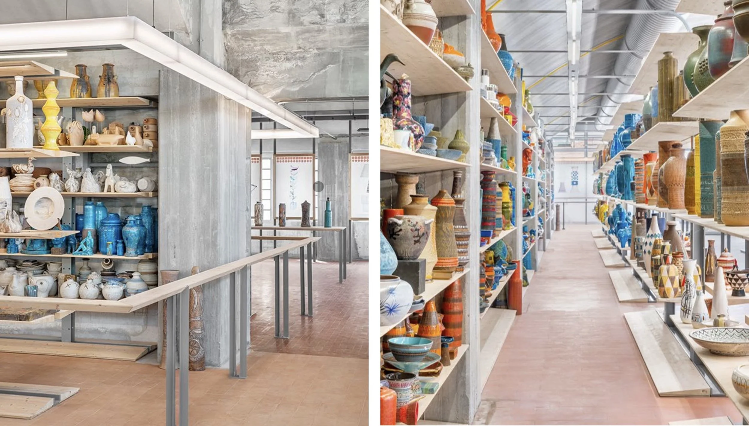
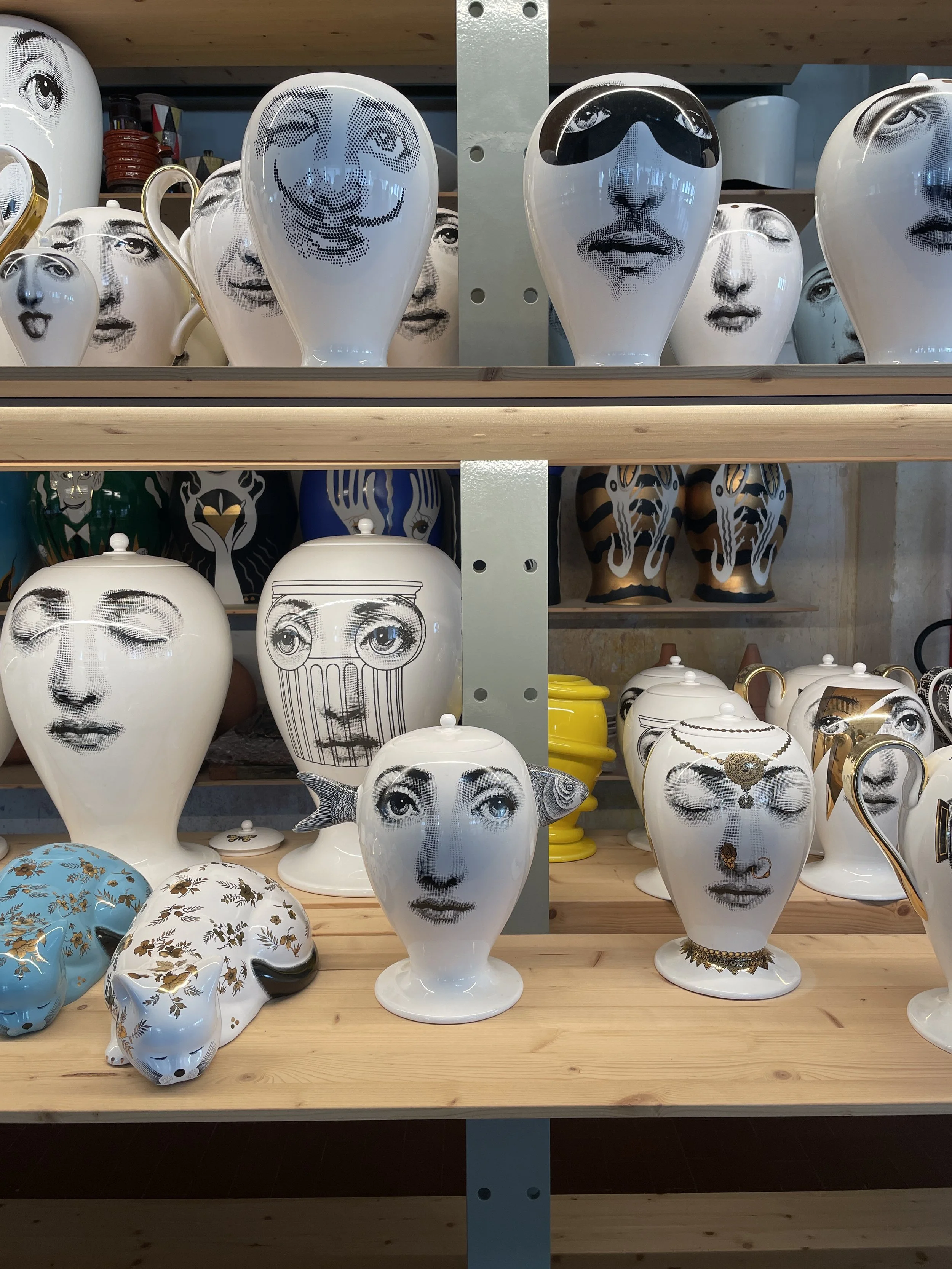
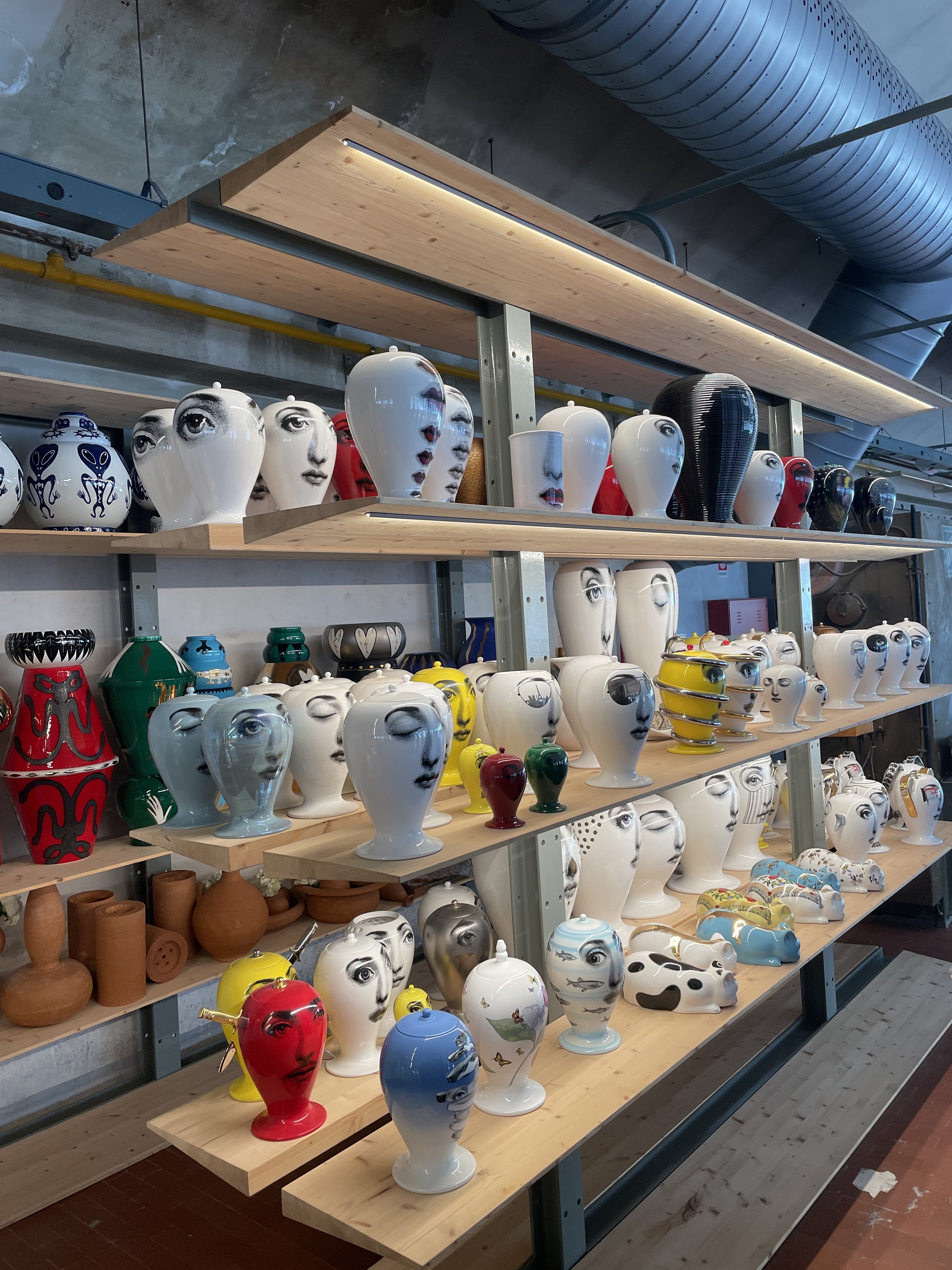
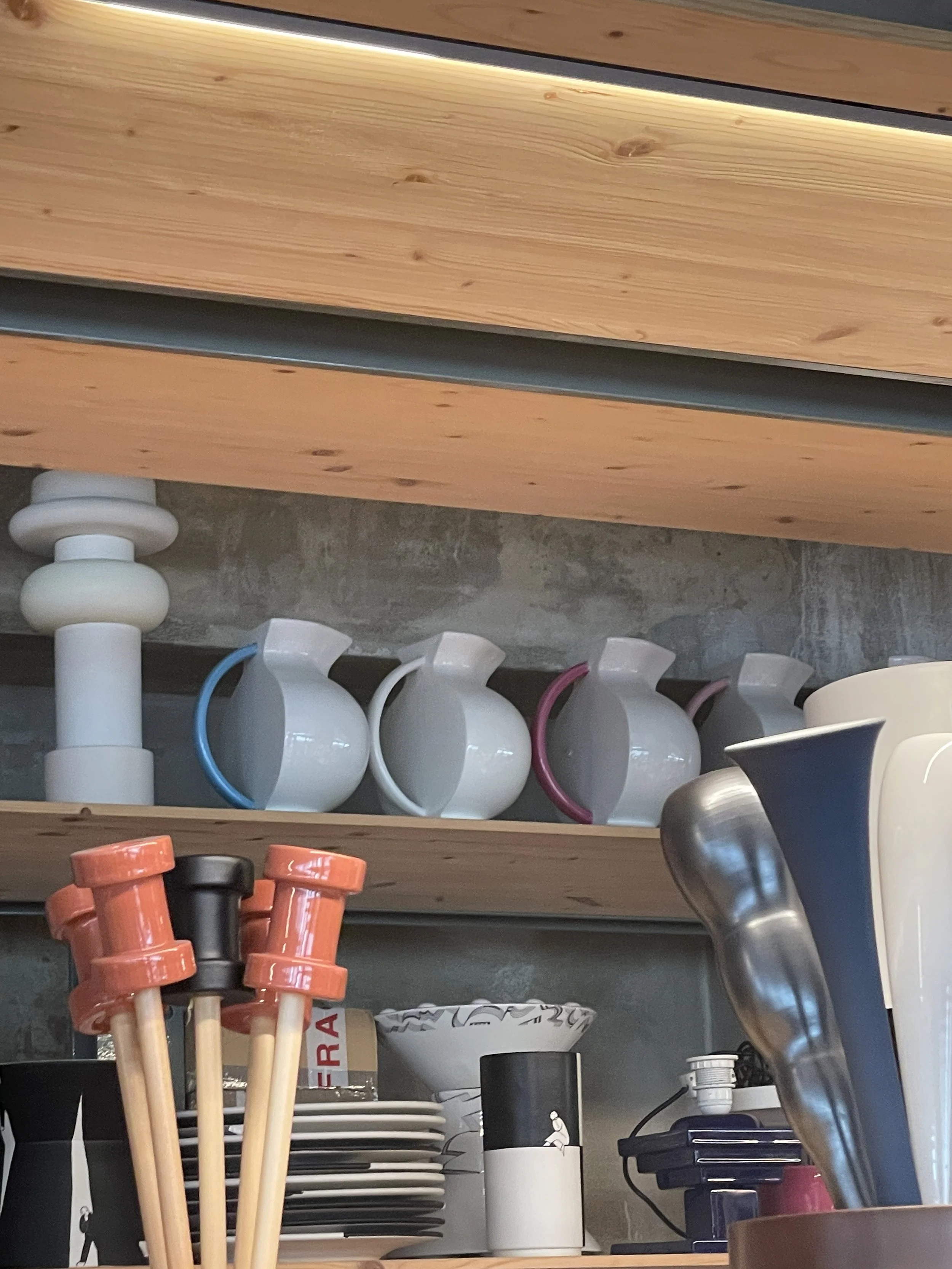
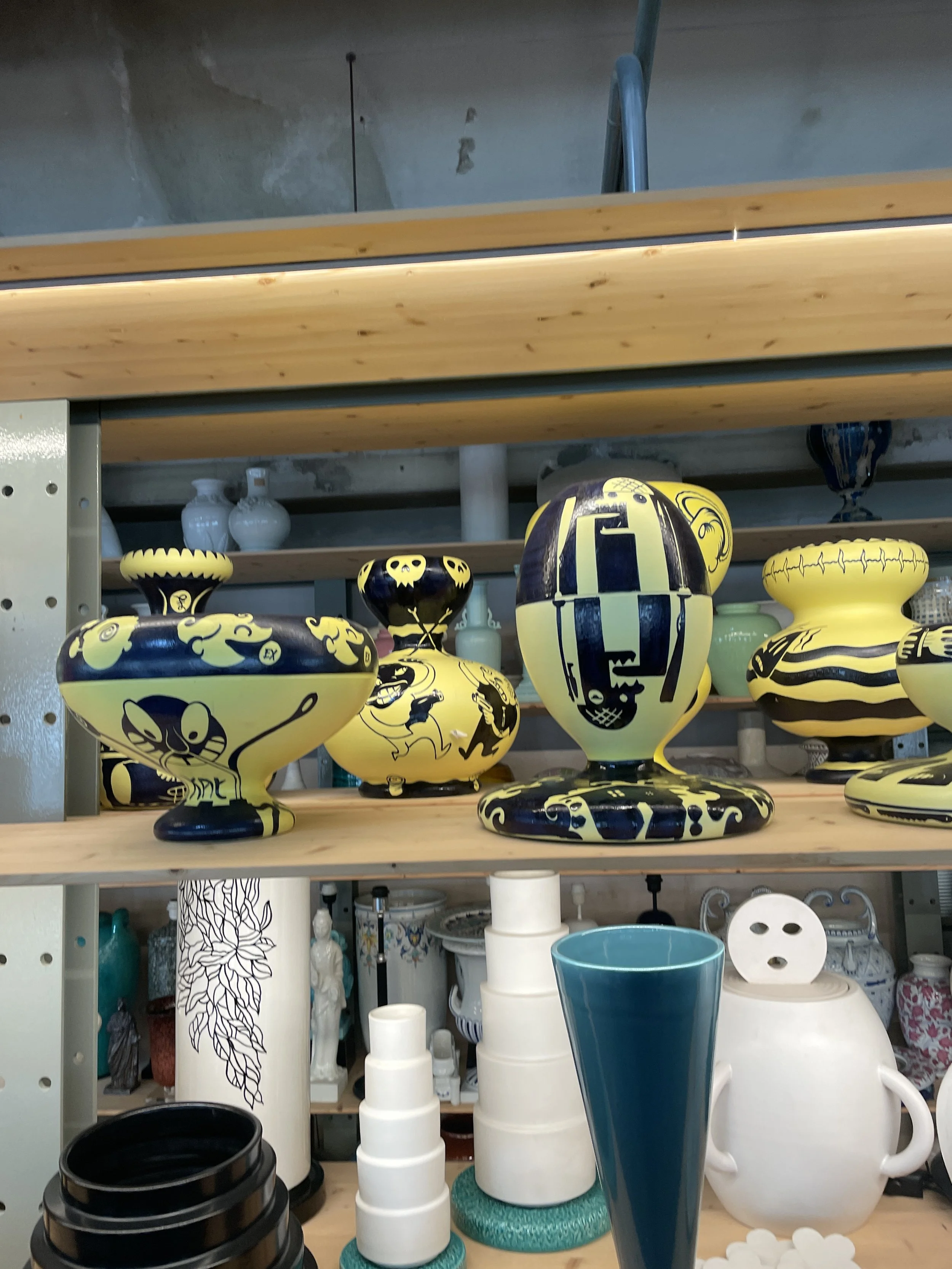
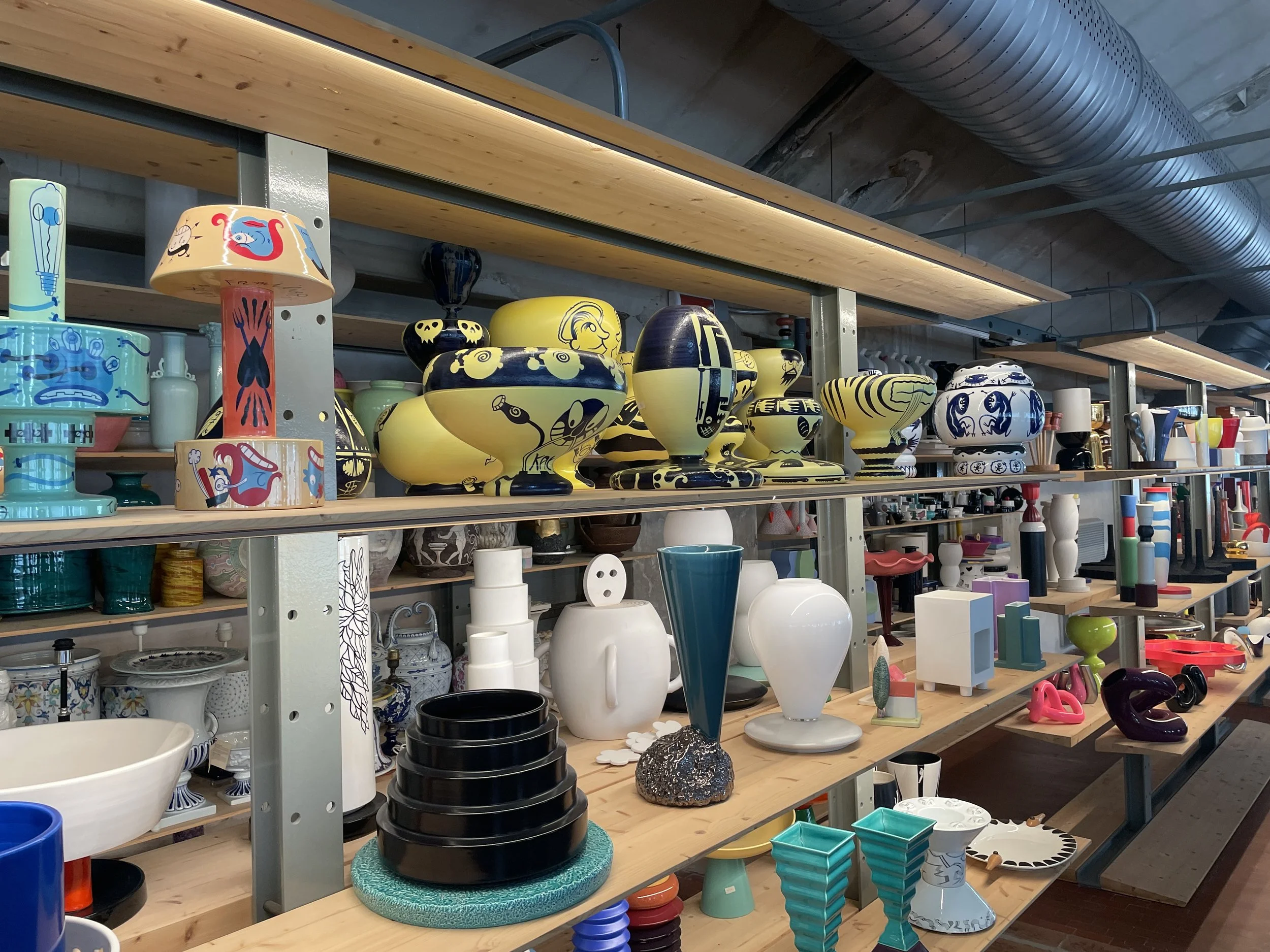
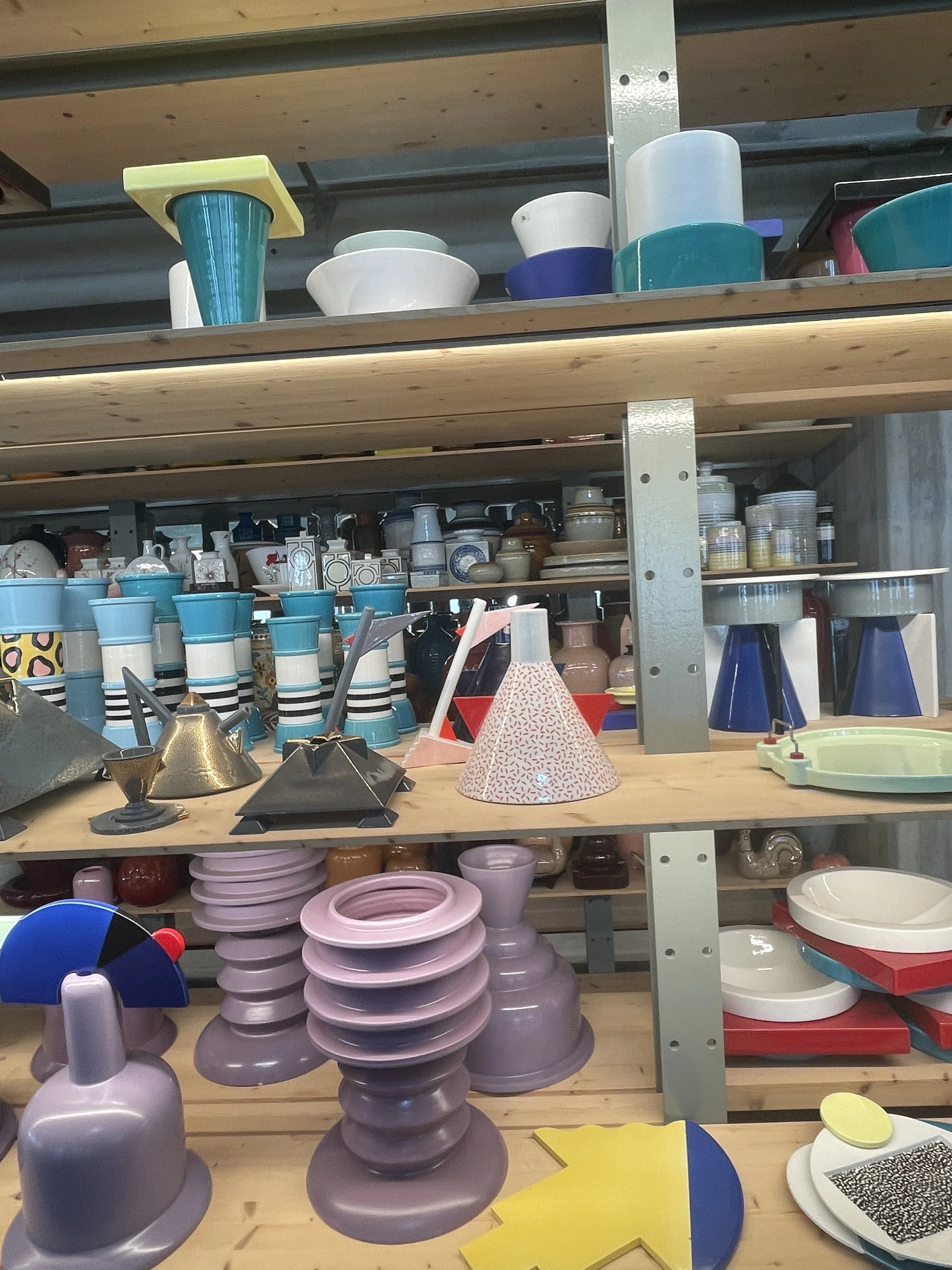
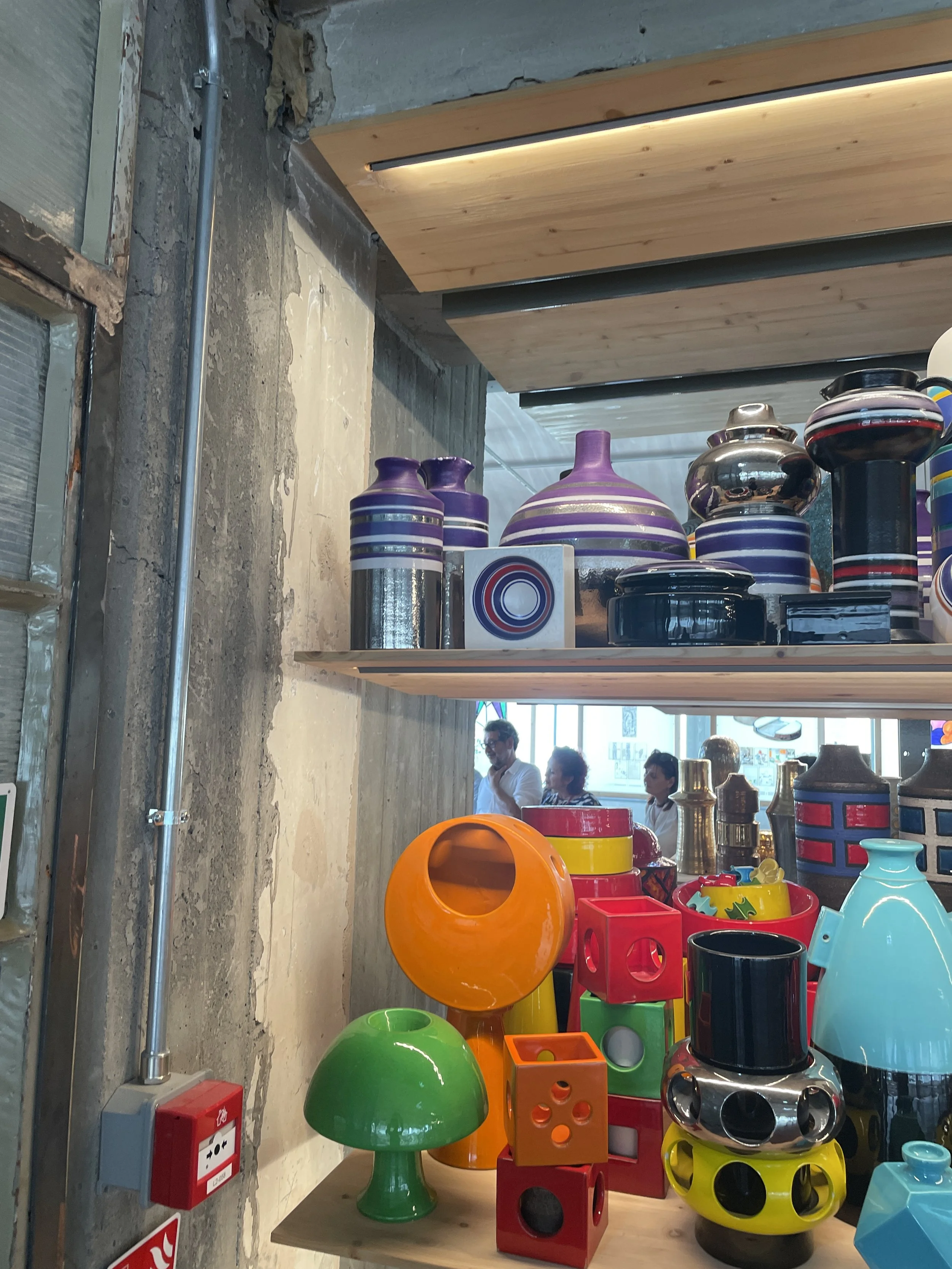
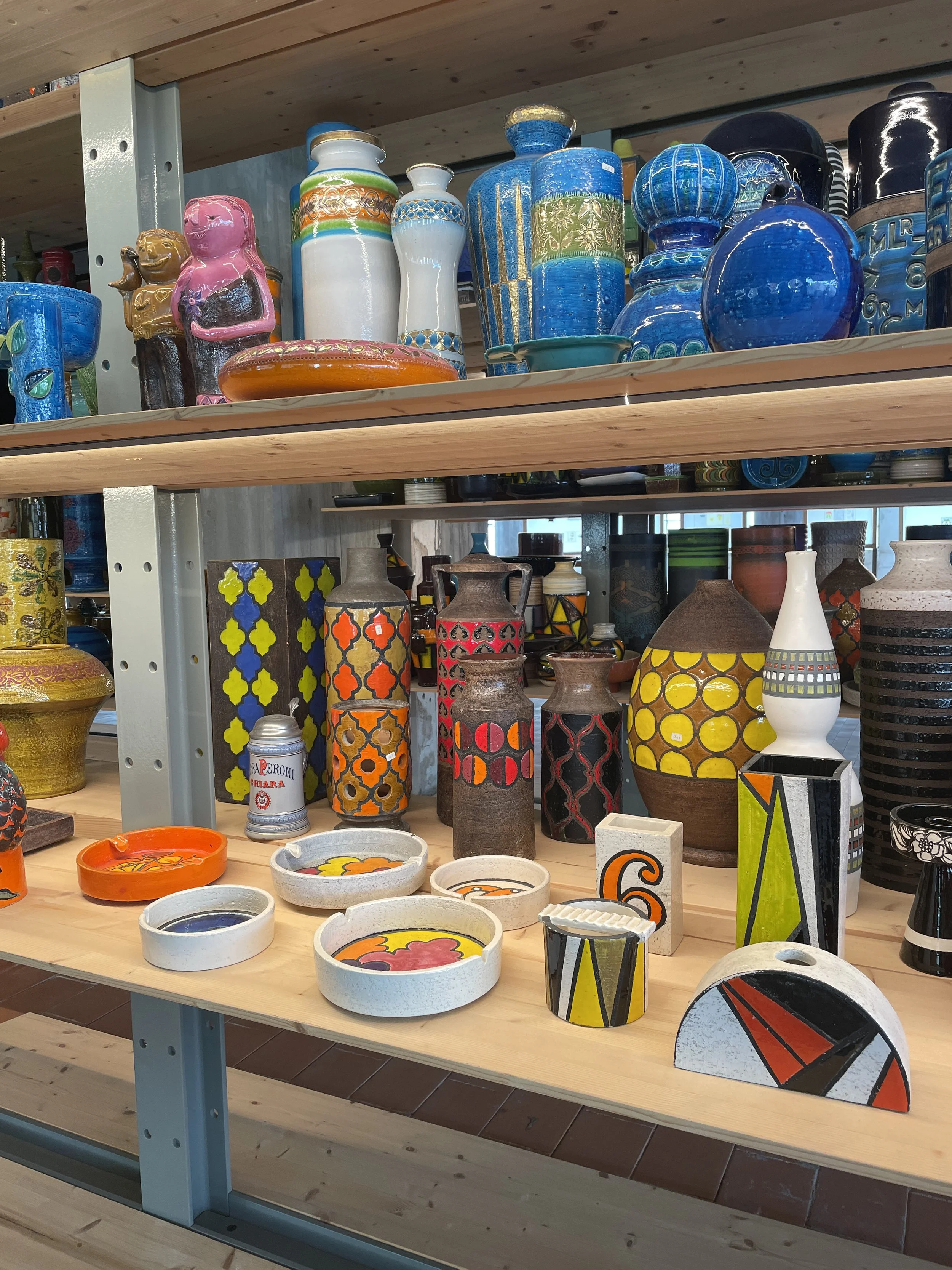
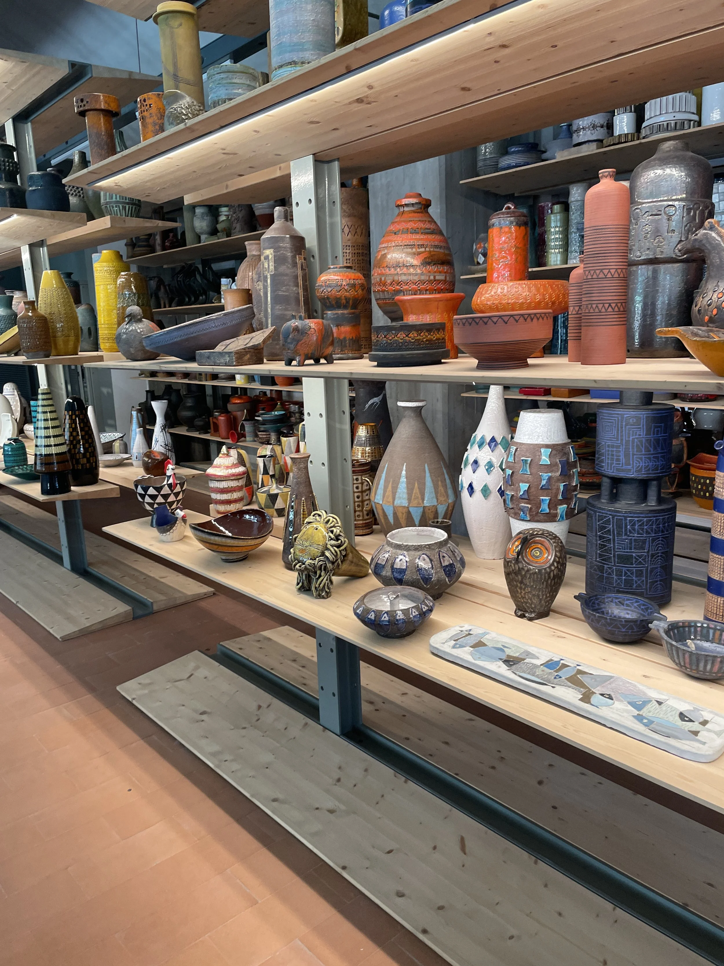
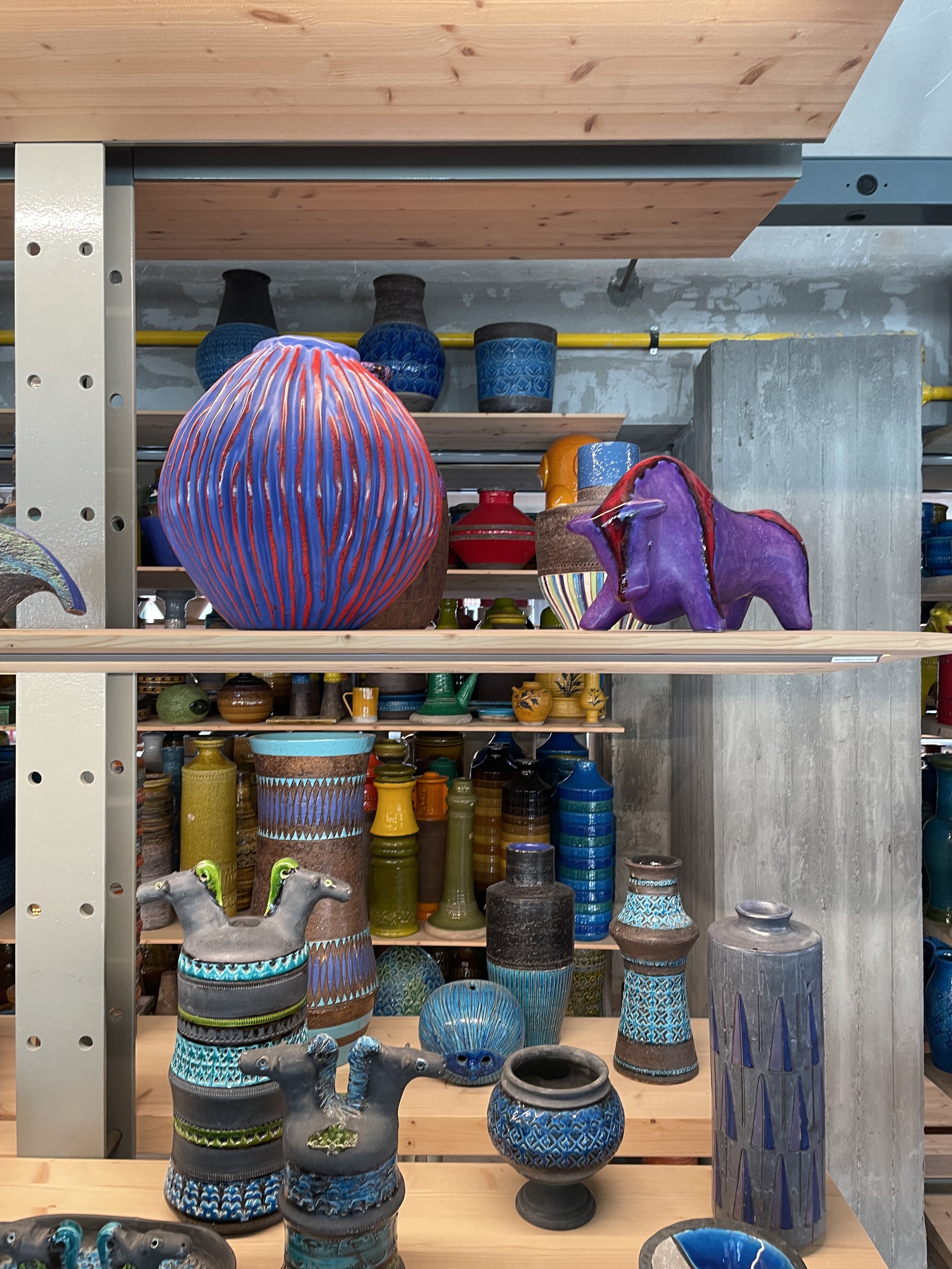
Every summer on the way to Elba, I stop in Montelupo to visit the Bitossi Museum. It is small, but to me it holds more color, invention, and attitude than many museums ten times its size. Shelves of vibrant glazes, bold shapes, textures that feel both ancient and futuristic—I always leave feeling full of ideas.
The collection is eclectic but sharply curated. It’s not about harmony—it’s about rhythm, contrast, and provocation. Bitossi is a reminder that ceramics can be serious and silly at once. That color can be an idea. And that sometimes, the best detours become traditions.
This year, because of immigration status issues, I won’t be going to Italy. So I opened my phone, scrolled back, and spent some time in Montelupo anyway. I thought I’d share a few photos and notes.
The Bitossi Museum
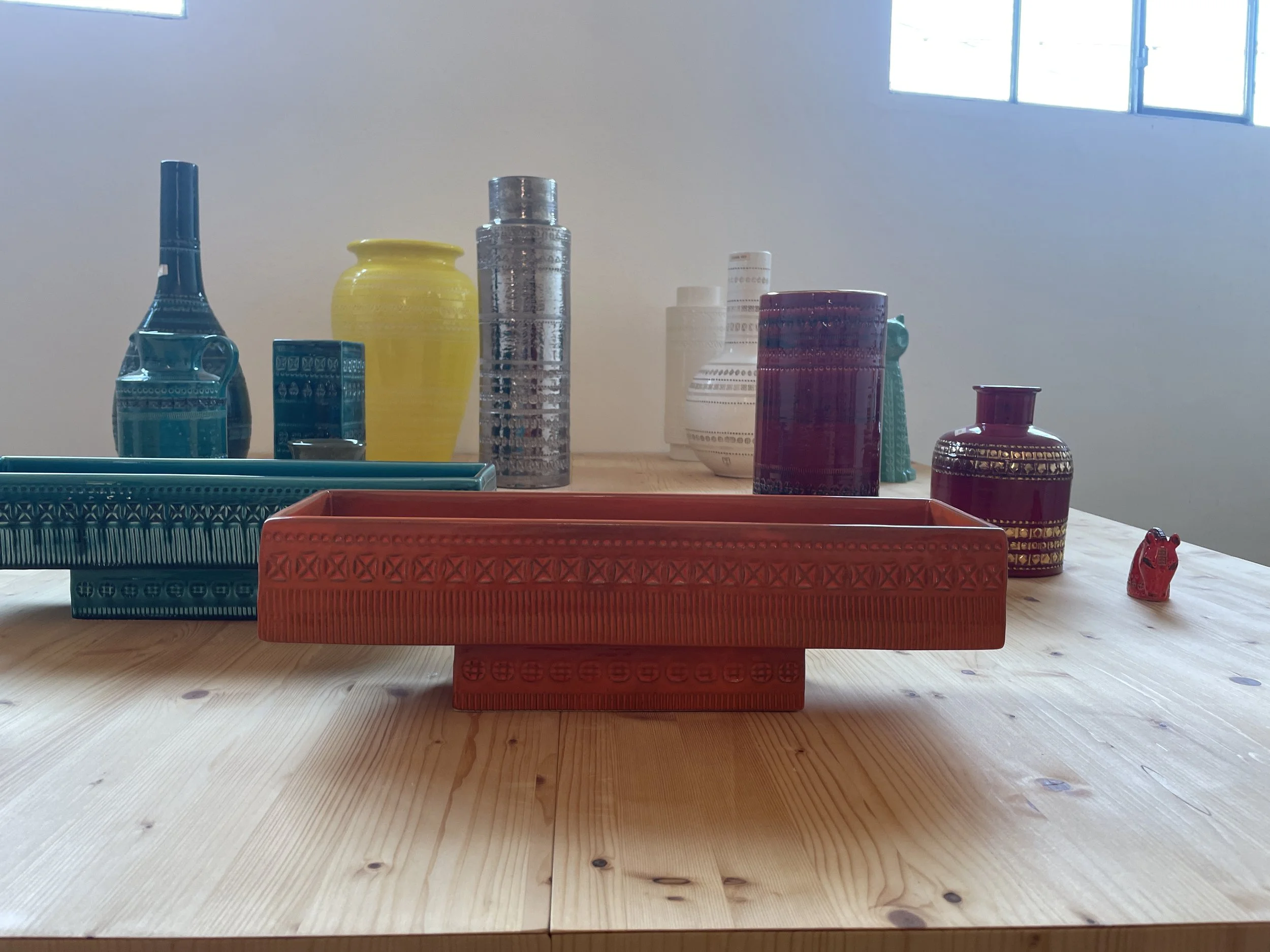
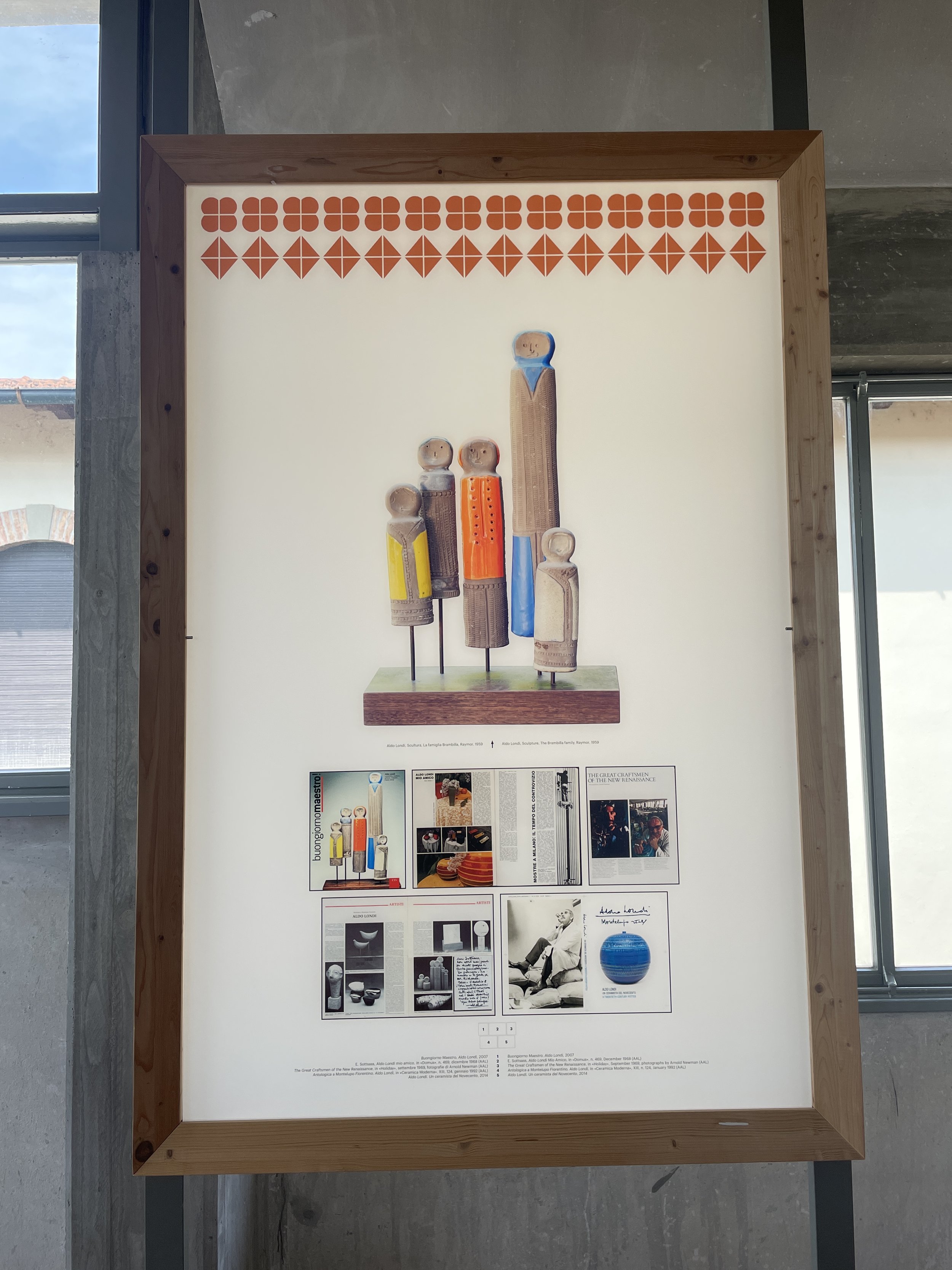
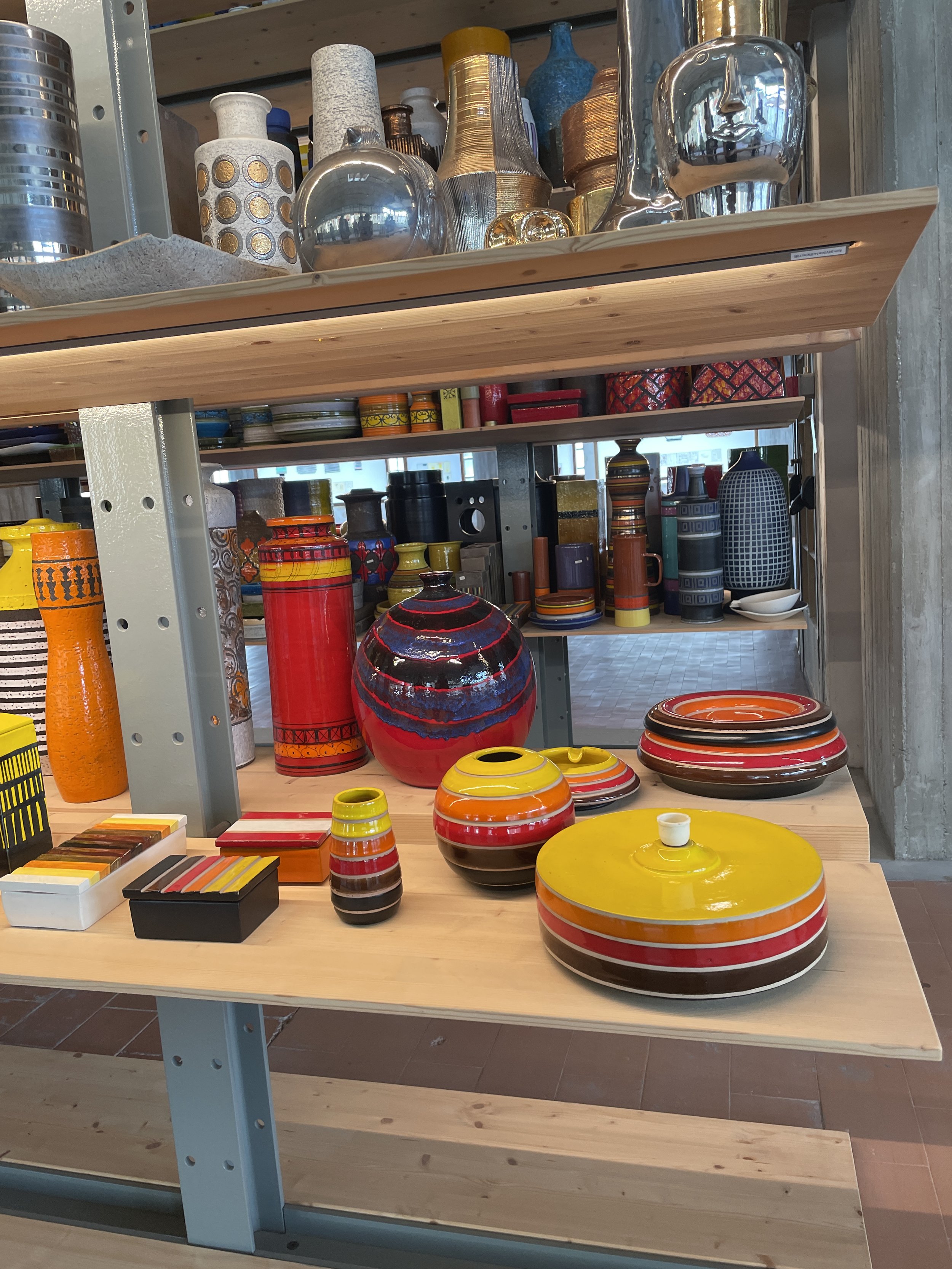
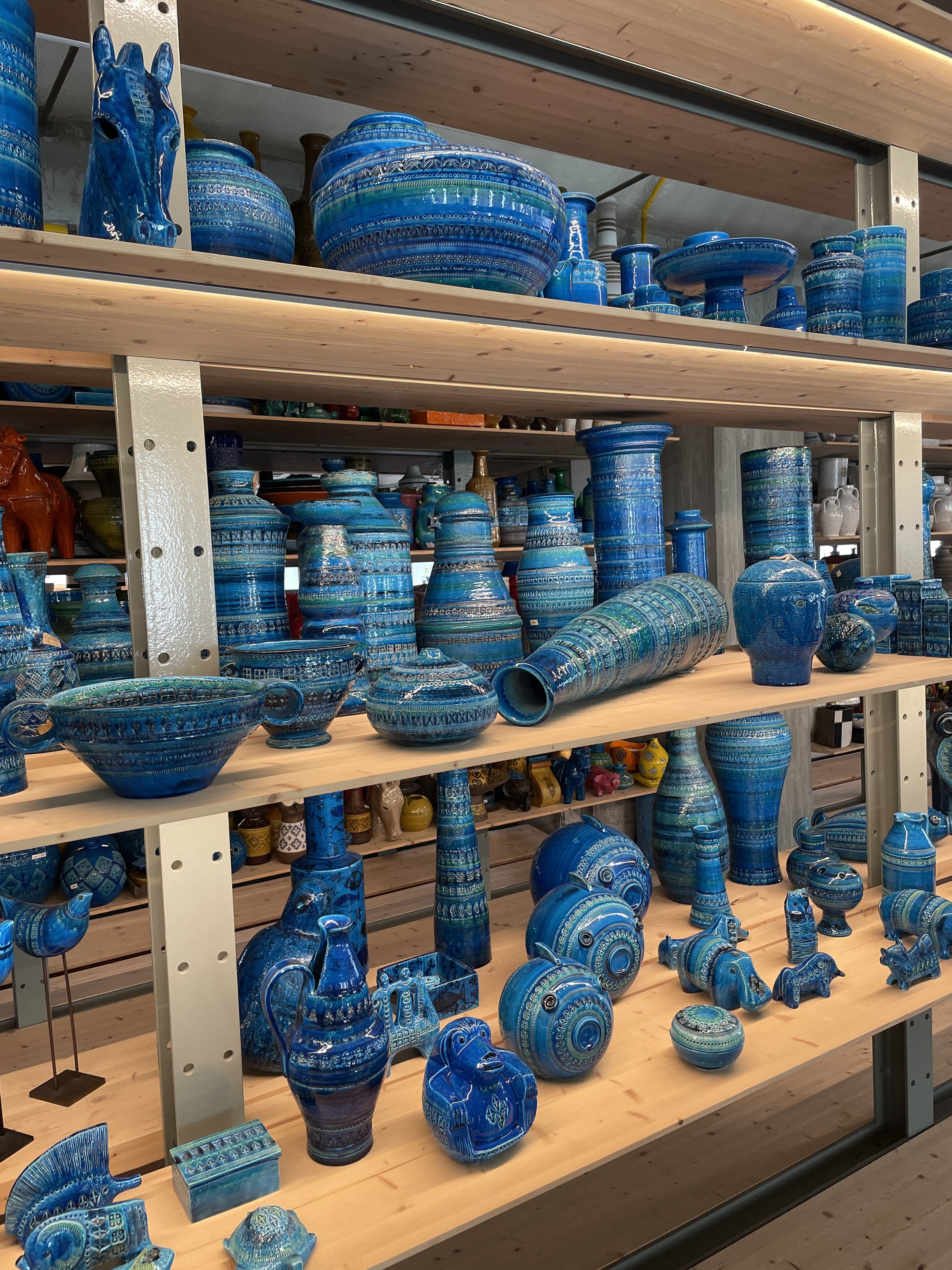
Bitossi was founded in 1921 and became a landmark of Italian ceramics under Aldo Londi in the 1950s. His iconic Rimini Blu series—those deep turquoise textures—still echoes through the archive. Over time, Bitossi’s collaborations expanded to include some of the most inventive minds in design: Ettore Sottsass, Nathalie Du Pasquier, Arik Levy, Karim Rashid, and many more. The results are bold, humorous, sculptural, and often slightly surreal. Even the serious pieces don’t take themselves too seriously.
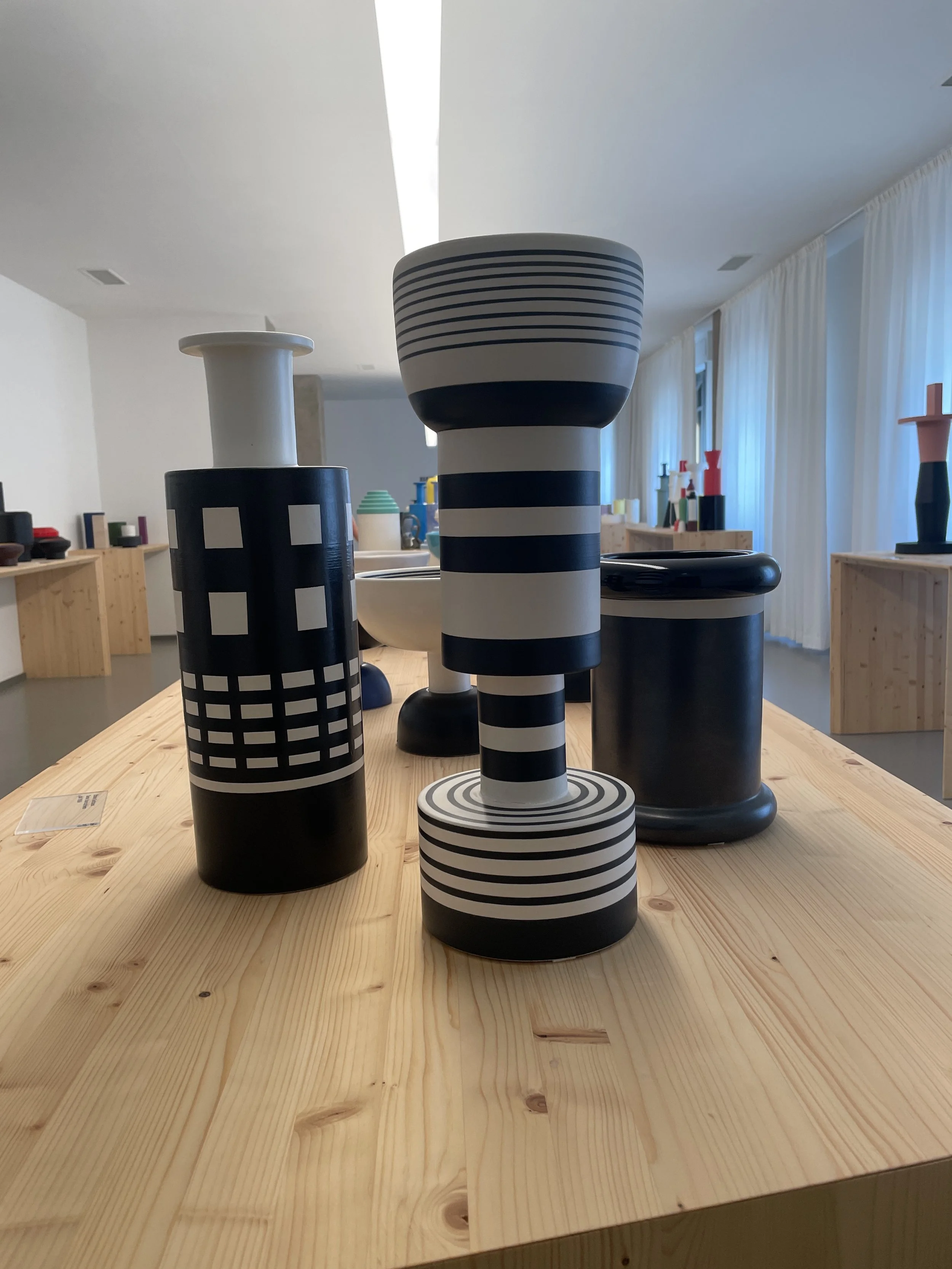
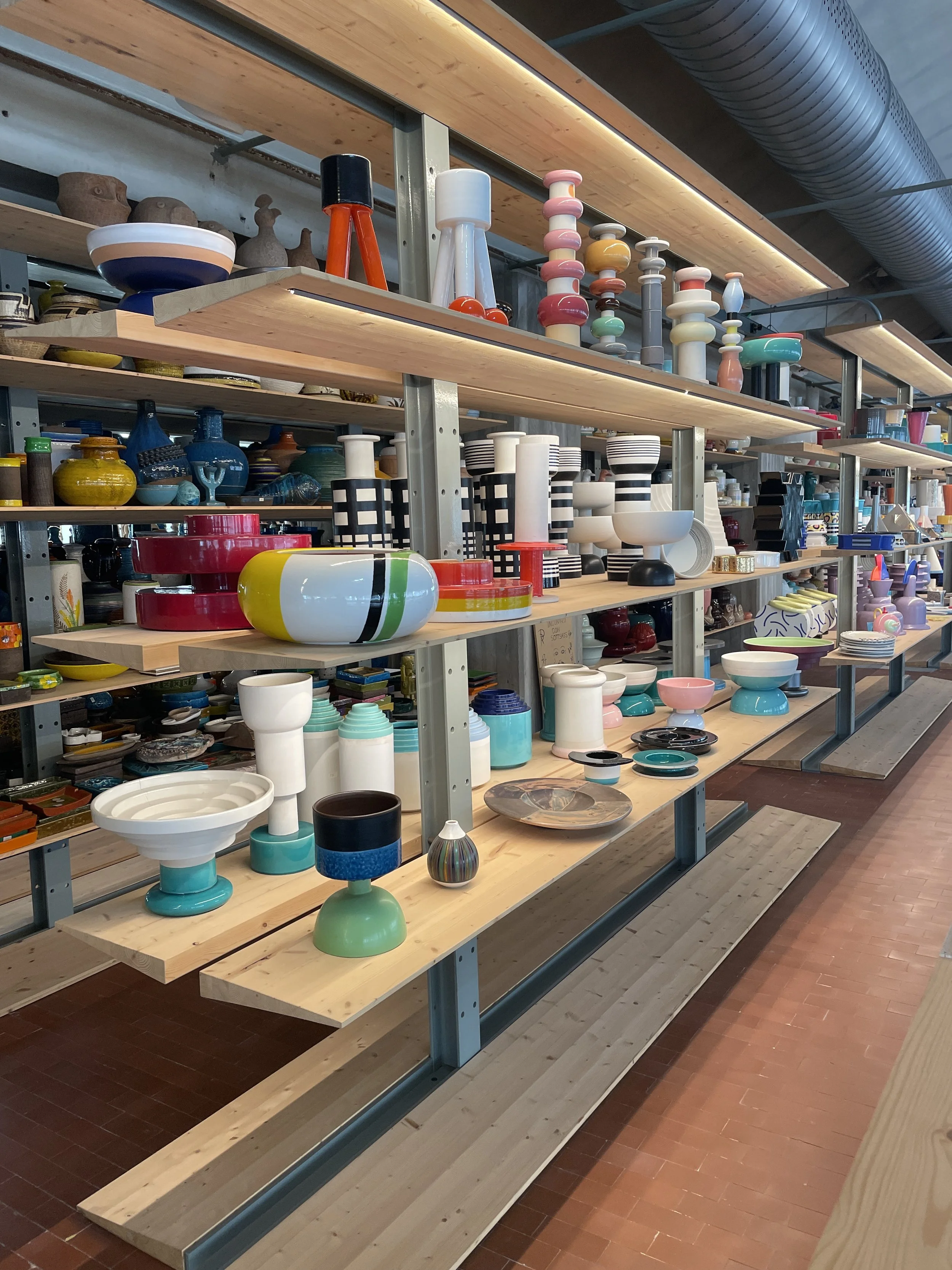
Sottsass forever: stacked rhythms, rigorous joy.
I don’t think I’ll ever tire of Sottsass. His totem sculptures for Bitossi are architectural but playful. They remind me that repetition doesn’t have to mean stillness. There’s movement here, even in the strictest stripes.
I also love his black-and-white striped vases—graphic, bold, almost stubborn in their rhythm. They're less about decoration and more about presence. You can feel the pencil-drawn thinking behind them. They hold space the way a poem does: with structure, contrast, and a little mystery.
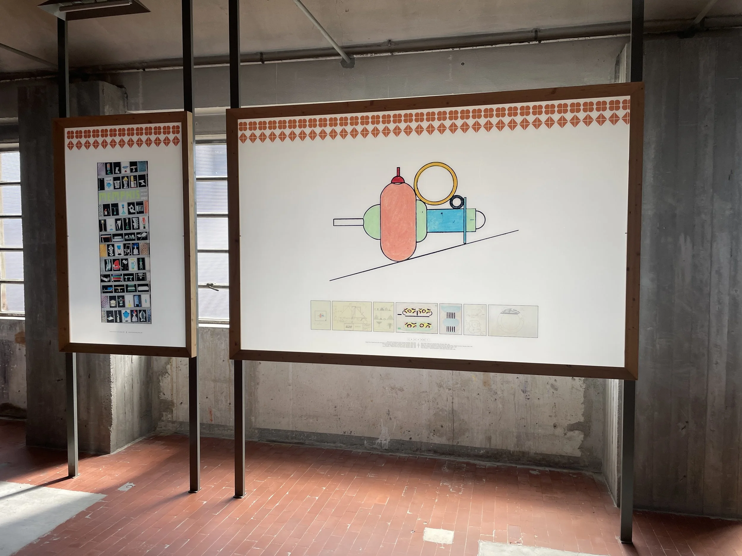
Marco Zanini for Memphis Milano:
ceramics as drawing, drawing as structure.
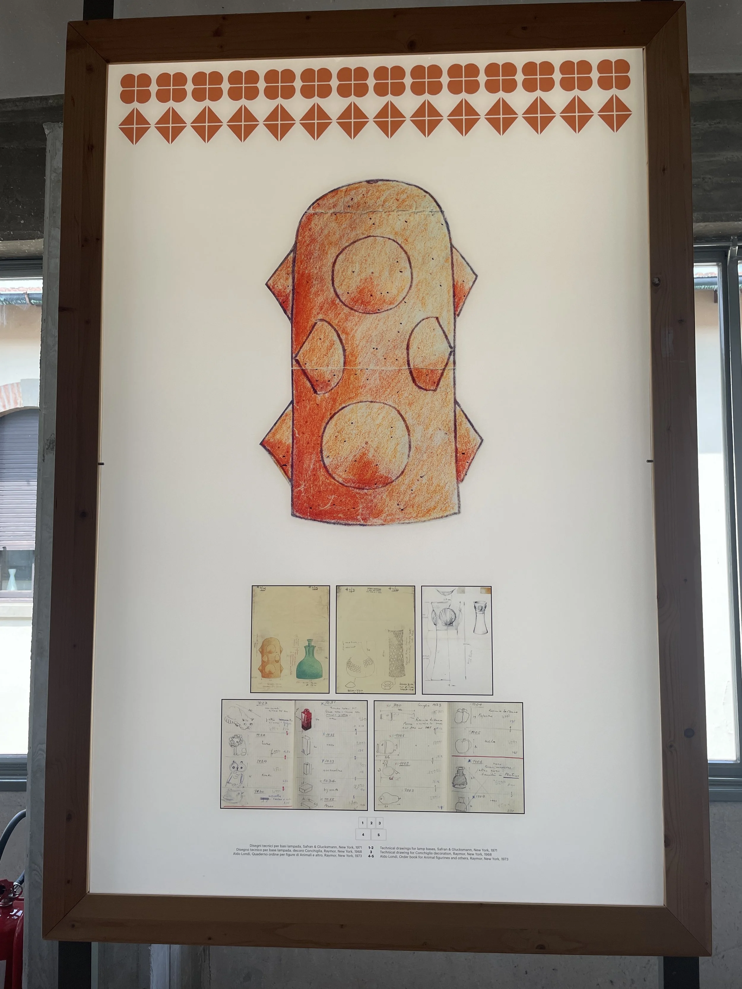
One piece that stays with me is a sculptural form by Marco Zanini, shown beside its original drawing. It’s part of the Memphis Milano spirit—full of asymmetry, color play, and joyful defiance of function. Seeing the sketch next to the finished work reminds me how much freedom ceramics can hold. You don’t need to start from shape. You can start from a doodle, a line, a joke—and end up with something surprisingly sincere.
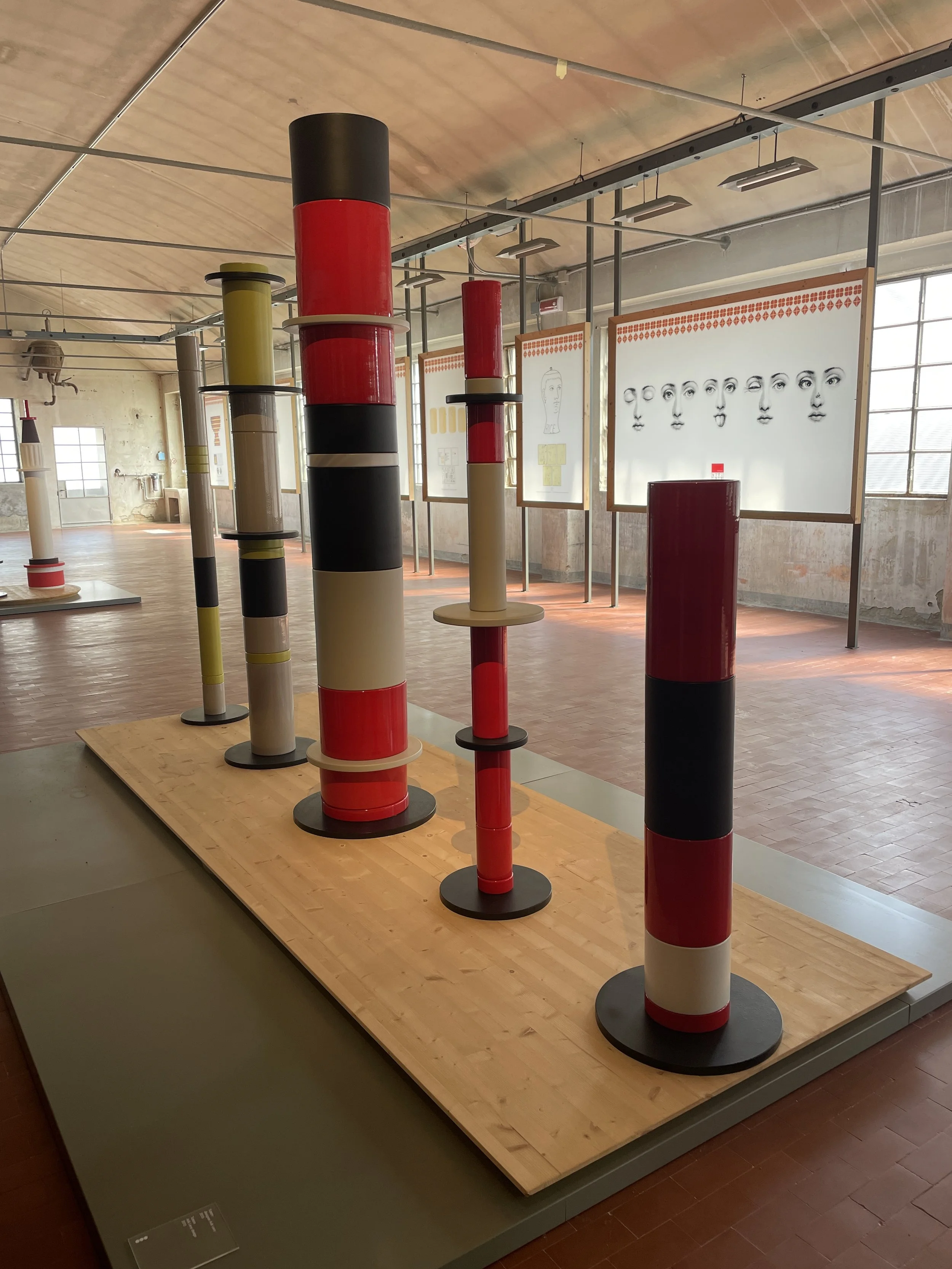
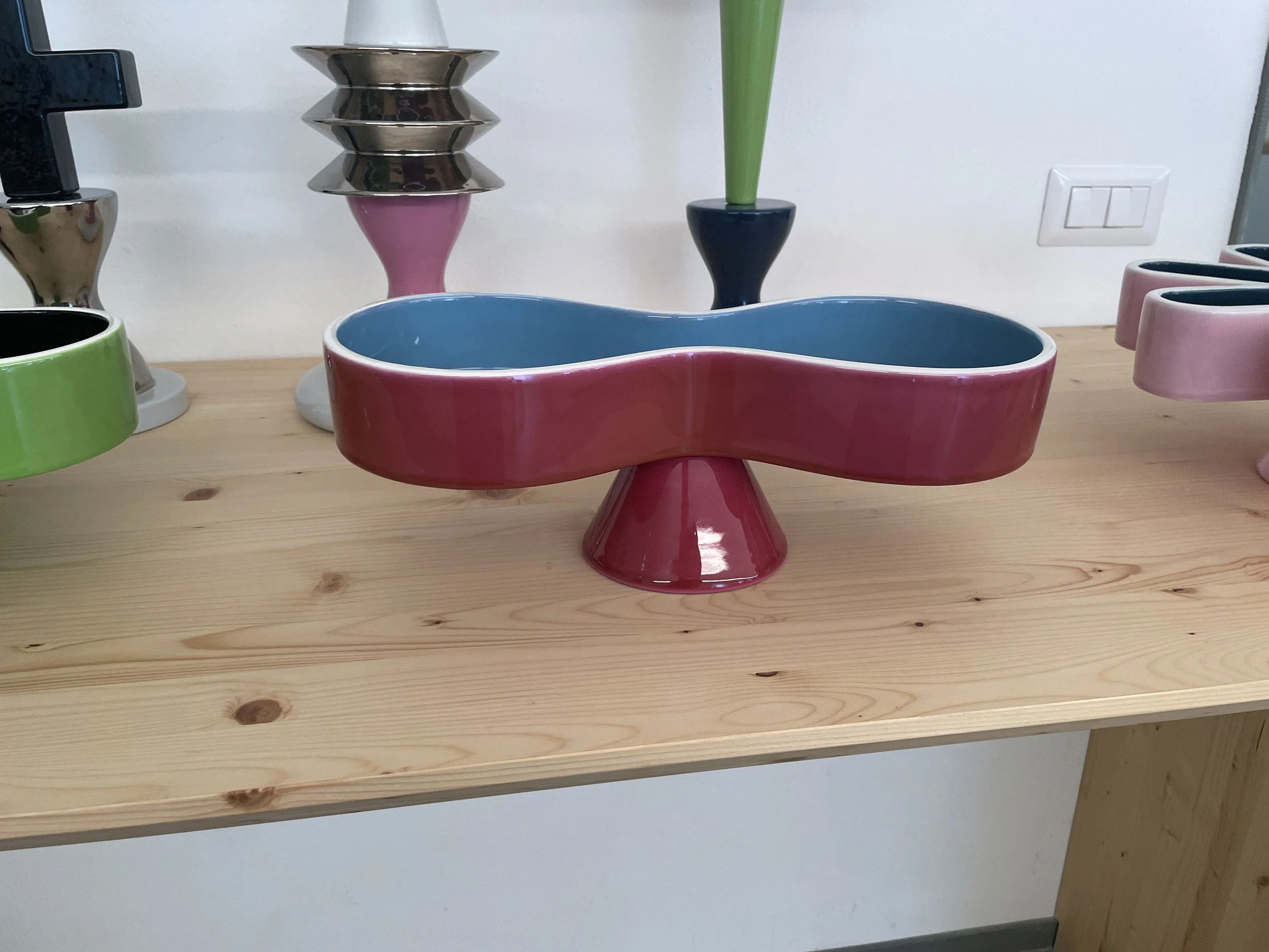
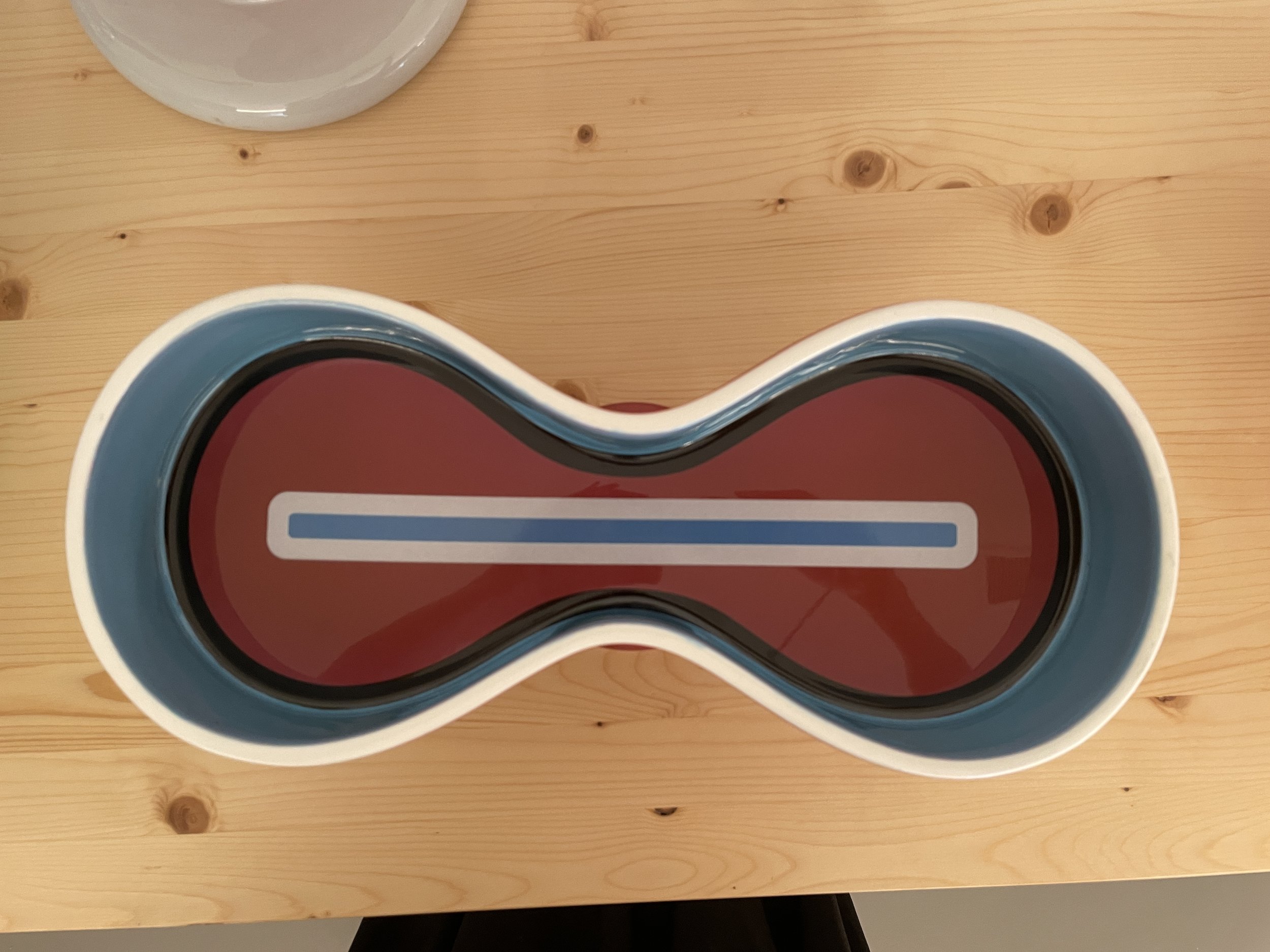
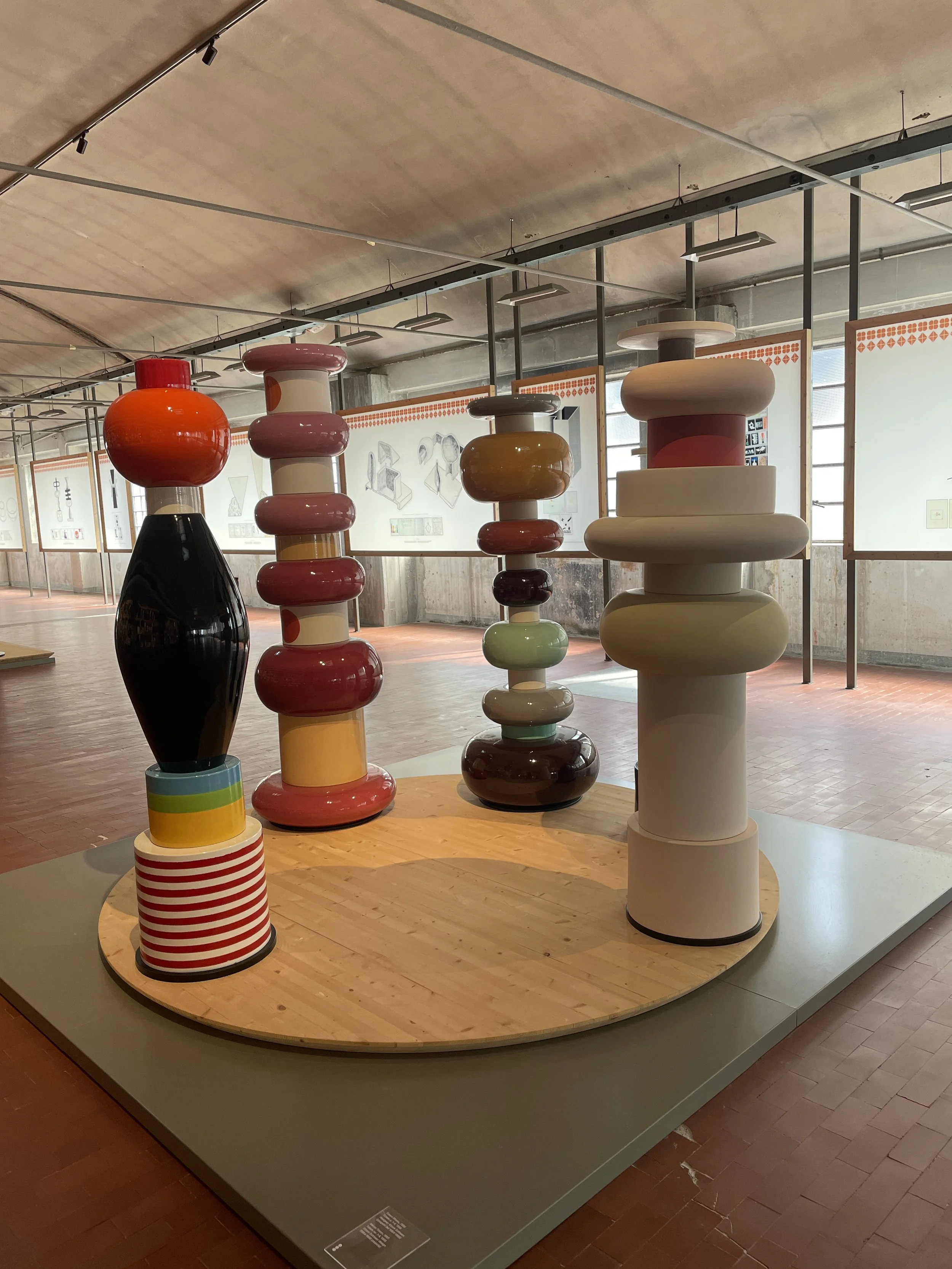
Arik Levy’s Totems:
glossy, monumental, and unapologetic.
These pieces make me think of toys that grew up and decided to take up space. The scale, the color choices, the lacquered finish—they’re bold without being loud. I love how they manage to feel both industrial and cartoonish. They don’t whisper. They claim their spot. The candy-red glaze is glossy to the point of surrealism. They make me think of oversized chess pieces, or building blocks left behind by giants.

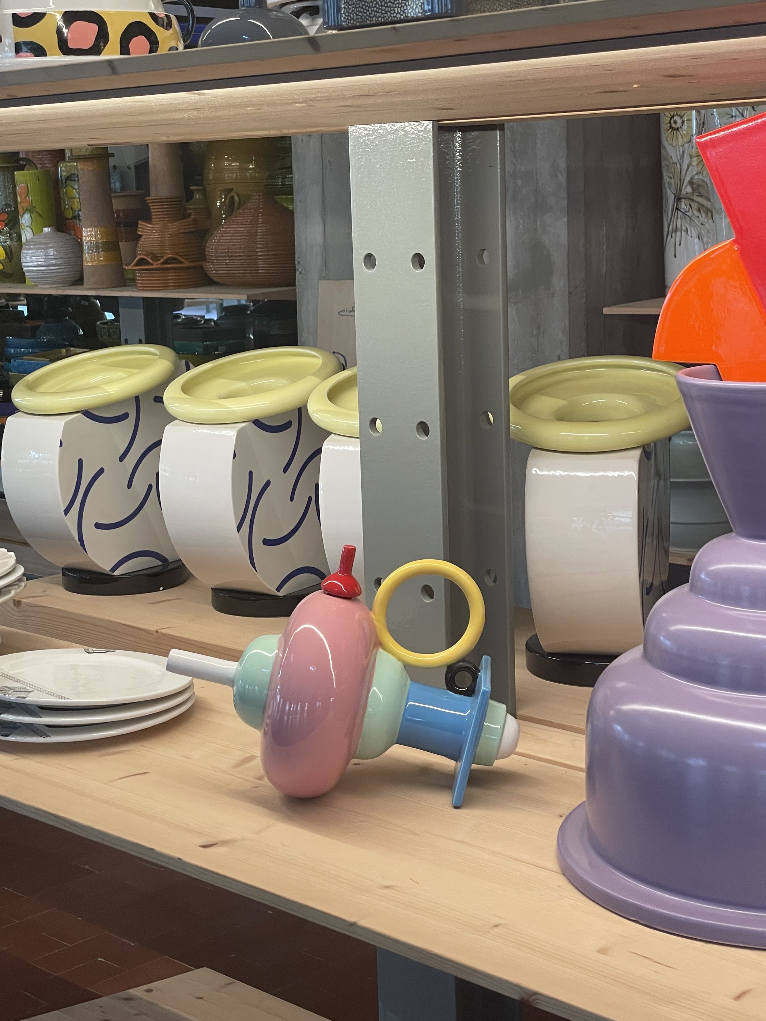
Karim Rashid’s
Soft Pop: space-age whimsy , futurism and candy color.
Karim Rashid’s pieces are unmistakable: round-edged, oddly tender. It’s playful but never superficial. And when it sits among more historical pieces, it still holds its own.
Bitossi always reminds me that ceramic history is still very much alive—and still changing. Even when I can’t travel, even when everything feels paused, I look at these photos and feel that familiar pull toward the wheel, the carving tool, the color test tray.
Some stops become rituals. This one’s mine.